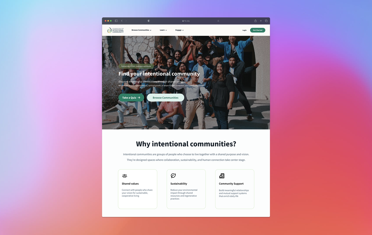
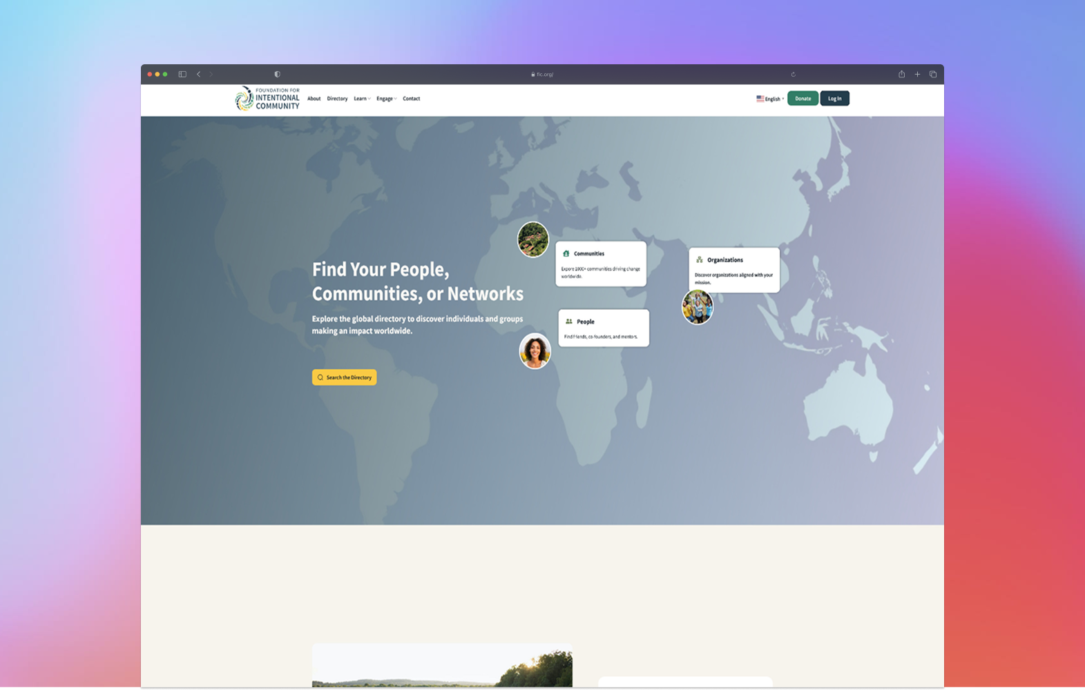
FIC had hundreds of intentional communities. Users had no idea how to find the right one, or what "right" even meant to them. The redesign focused on guiding discovery before asking users to search.
Users weren't just confused by the interface. They were confused about themselves: what kind of community they wanted, what questions to even ask. The site assumed they already knew.
FIC's existing platform offered hundreds of communities but no guidance for first-time visitors. Users arrived with vague intentions and left without finding anything relevant. The gap wasn't search. It was orientation.
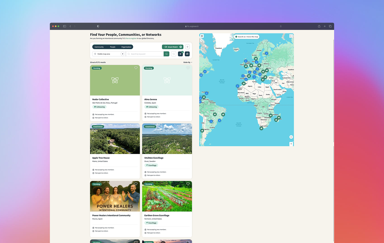
Both pages presented options without context: no guidance on what to look for or how to narrow down.
AI-assisted synthesis to pressure-test the research.
Reviewed the Catalog and Search pages to identify where users were dropping off and what information was missing or misleading.
Ran 8+ usability sessions to observe how users navigated the platform and where their decision-making broke down.
Used AI-assisted analysis to identify clusters across session data, then validated those clusters against my own observations before letting them drive design decisions.
Used an effort/impact matrix to focus on the Landing Page and Search Communities Page, the two highest-traffic, highest drop-off points.
Delivered annotated wireframes and component-level prototypes, validated through two rounds of design QA.
Guiding users through discovery before asking them to search.
Leads with orientation instead of options. Educational content, community types, and clear calls to action replaced the previous wall of choices.
Rebuilt around progressive browsing. Filters became more intuitive, community cards surfaced decision-relevant information first, and the path from curious to clicking became shorter.
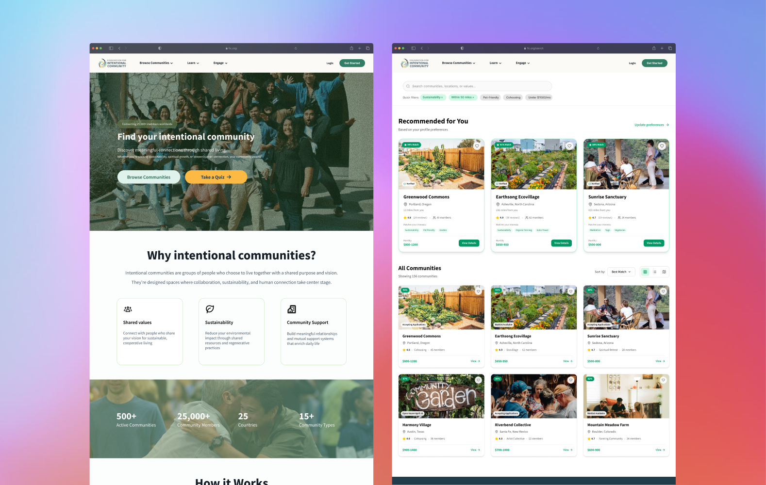
A redesigned discovery experience that meets users at every stage of their decision, from curious to committed.
Using AI to cluster research data surfaced patterns I might have rationalized away. It made the research more honest, not faster.
Focusing on two pages instead of the full site meant the changes that shipped actually moved the needle. Scope discipline is its own skill.
The best design gave users room to think.
Designing for a decision as personal as where to live and with whom required extra care not to oversimplify. The best design choices here weren't the most elegant ones. They were the ones that gave users room to think.