Mindful Digits is an EdTech app for fifth-grade learners with ADHD, built around scaffolded dialogue designed to reduce math anxiety. As Lead UX Writer, I led content strategy, dialogue design, and mascot voice development, making geometry feel less like a wall and more like a game worth playing.
Students with ADHD were disengaging before they ever got to the content.
The app's language was too abstract, the pacing was unforgiving, and there was nothing to hold attention between tasks. Students weren't failing because the math was too hard. They were failing because the experience wasn't designed for how their brains actually work. Research showed neurodivergent children experience 3–5x more difficulty than neurotypical students in traditional math environments.
Students failed tasks 3–5x more than expected, not from lack of ability but from interface friction and cognitive overload.
Design for how their brains actually work, not how the curriculum assumes they should.
Analyzed prior research summaries, voice and tone guidelines, content strategies, and UX writing boards to build on established insights rather than starting from scratch.
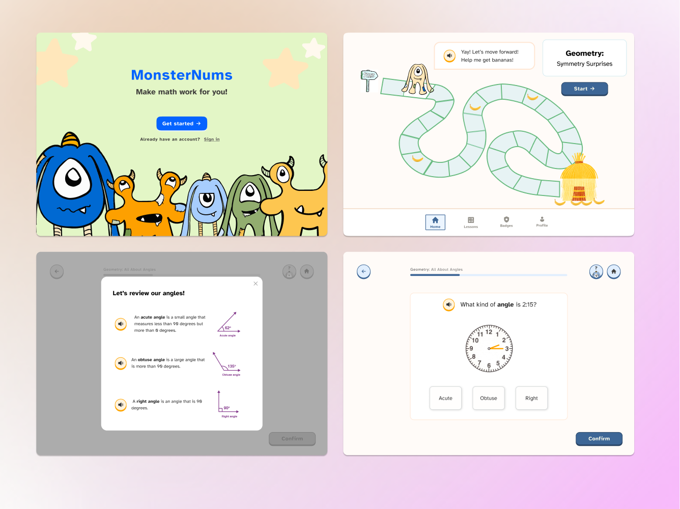
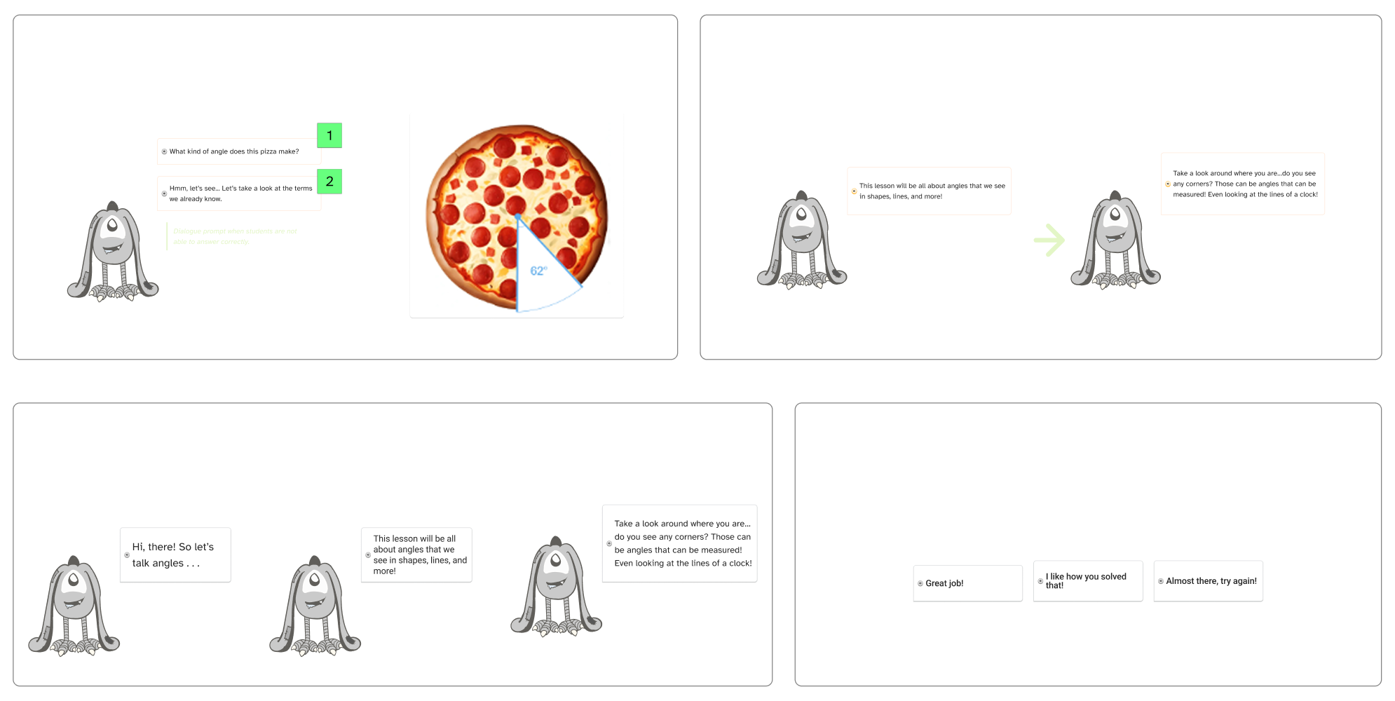
Established the Math Buddy's character as enthusiastic, relatable, conversational, and inviting, with a tone that is playful, casual, respectful, and encouraging. Every content decision flowed from this foundation.
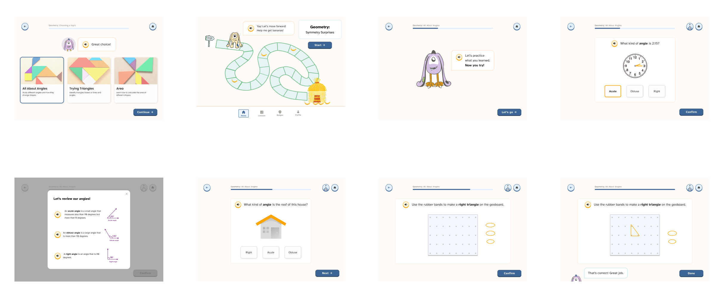
Wrote teaching scripts, follow-up dialogues, and error recovery prompts for three geometry units: Angles, Triangles, and Volume. Used real-world examples like pizza slices to make abstract concepts tangible for fifth graders.
Coordinated team brainstorming across five rounds to land on a character identity that would resonate with the target audience, balancing personality, memorability, and age-appropriateness.
Synthesized key learnings, communication norms, persona guidelines, and curriculum scope into structured documentation for the final phase team.
A content system built around confidence, not just comprehension.
A fully defined character voice with teaching scripts, encouraging feedback, and error recovery dialogue, designed to reduce anxiety and build confidence at every step.
Three complete geometry units with conversational prompts that guide exploration rather than test recall. Students are never left without a path forward.
Plain-language principles applied across all screens: short sentences, active voice, and encouraging tone, meeting WCAG 2.1 AA content guidelines for neurodivergent users.
A content system that meets neurodivergent learners where they are, giving the next phase team a foundation to build on.
Recovery prompts keep learners moving through a stumble instead of stopping at it.
Paced for fifth-grade geometry learners and grounded in prior-phase research.
The structured docs became the starting point for the next phase team.
Establishing the Math Buddy's character early gave every design decision a reference point. Tone consistency across 3 units and dozens of screens started with getting the voice right first.
Structured knowledge transfer is its own form of UX work.
"Accessibility and good UX are the same thing approached from different angles. Every plain-language rewrite, every scaffolded step, every encouraging prompt made the experience better for everyone, not just students with ADHD."
Clarity is kindness.
This was my first time leading content strategy for a neurodivergent audience, and it changed how I think about language in interfaces permanently. The most important lesson was that clarity is kindness. Every word that made the experience simpler for a student with ADHD made it better for everyone else too. If I could do one thing differently, I'd advocate earlier for usability testing with actual students rather than relying solely on prior phase research. The dialogue system and voice guidelines were grounded in learner research from earlier phases of the project, so the design decisions had a real foundation to build on.